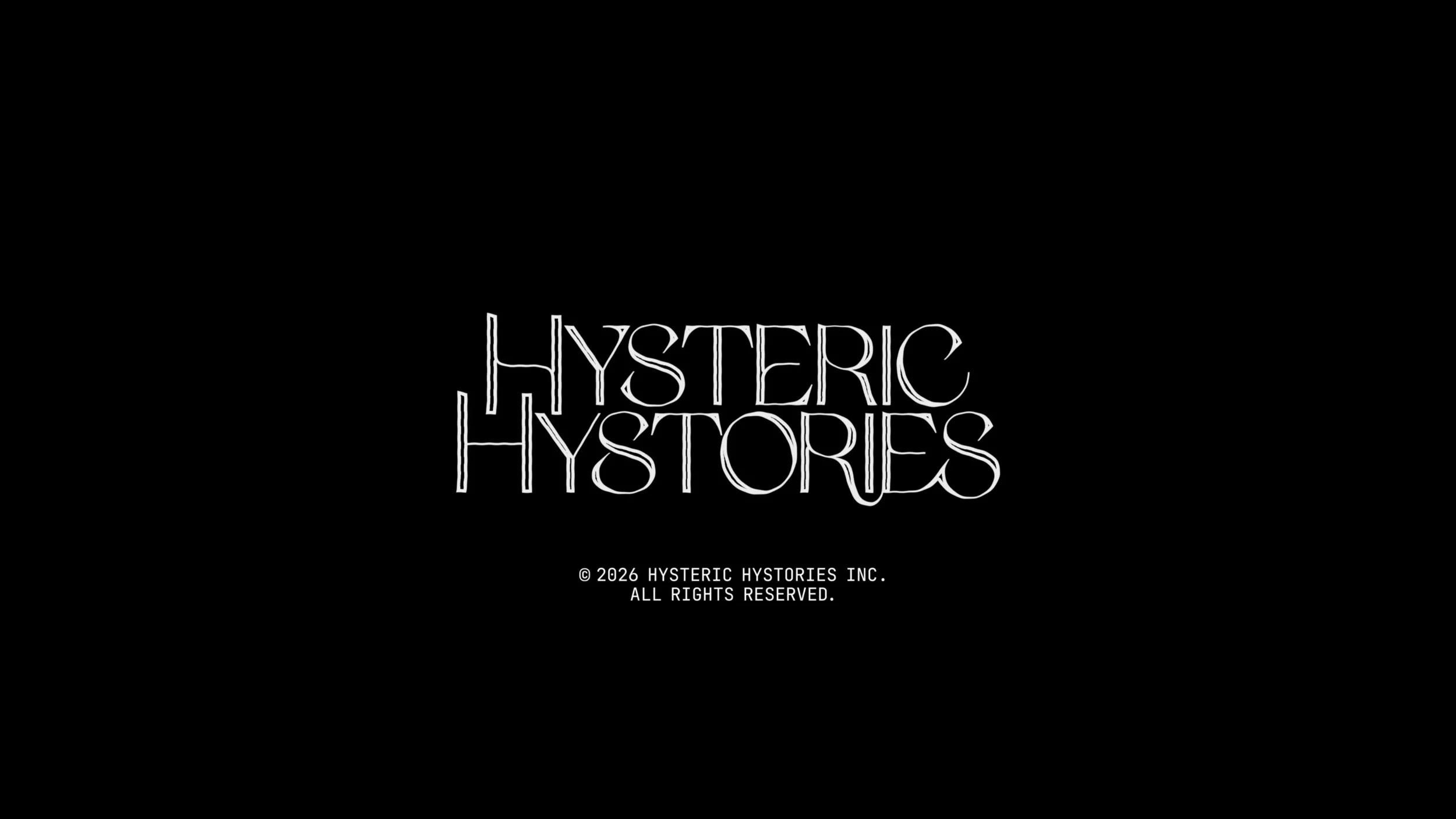
To Dress a Wound (2026)
Filmmaker Jenna Hanchard approached me to collaborate on creating a brand system for her short film series Hysteric Hystories. The first part, To Dress a Wound, centers Black girl grief, rage, and daydreams, examining the emotional weight Black women and femmes carry under racial capitalism and patriarchy, tracing how these histories live within the body while imagining space for release, healing, and expansion.
When choosing the typography for the project, it was important to echo the film’s intentions so I wanted to include the work of a Black type designer. I did some research and we settled on the typeface OS Korhogo by Ivorian artist and graphic designer O’Plérou Grebet.
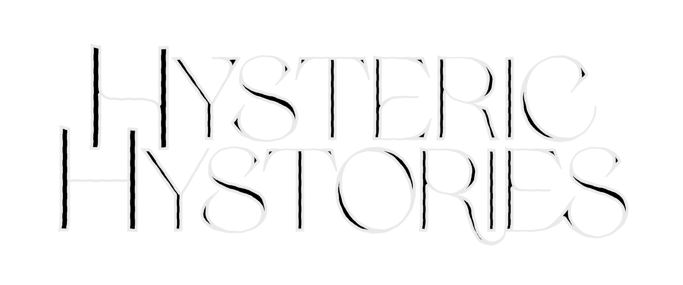
The typeface Korhogo pays tribute to the city of Korhogo in Côte d’Ivoire and its Senufo Culture. It combines elements of serif and sans letterforms, and has cursive features in some of its lowercase letters. The characters are sharp, highly contrasted, and have harmonious curved details.
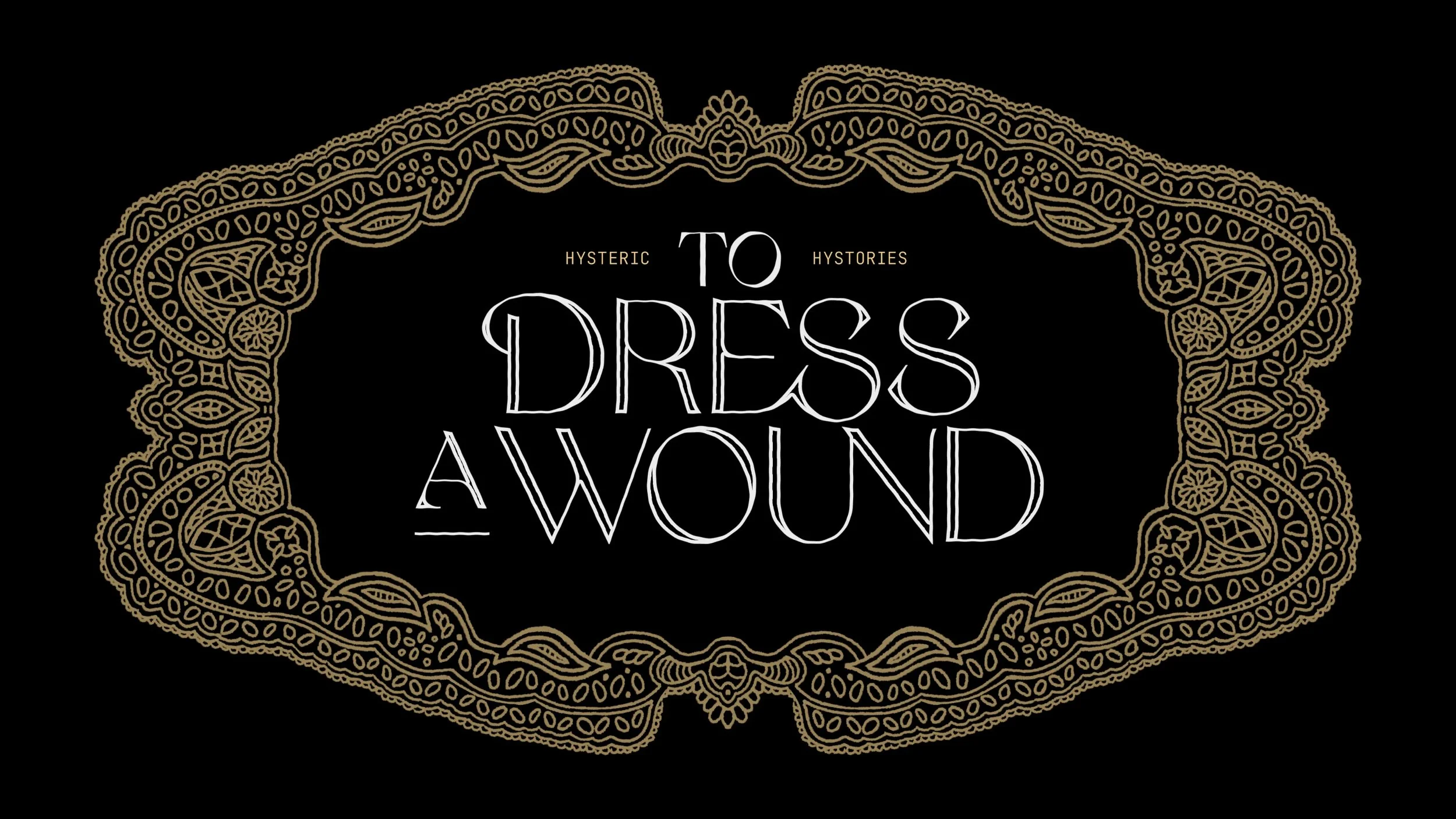
I customized the typeface with an unsteady outline to match the aesthetic we were building for the film and created an ornate border for the title, drawing on lace designs from the mid-19th century.
Poster design
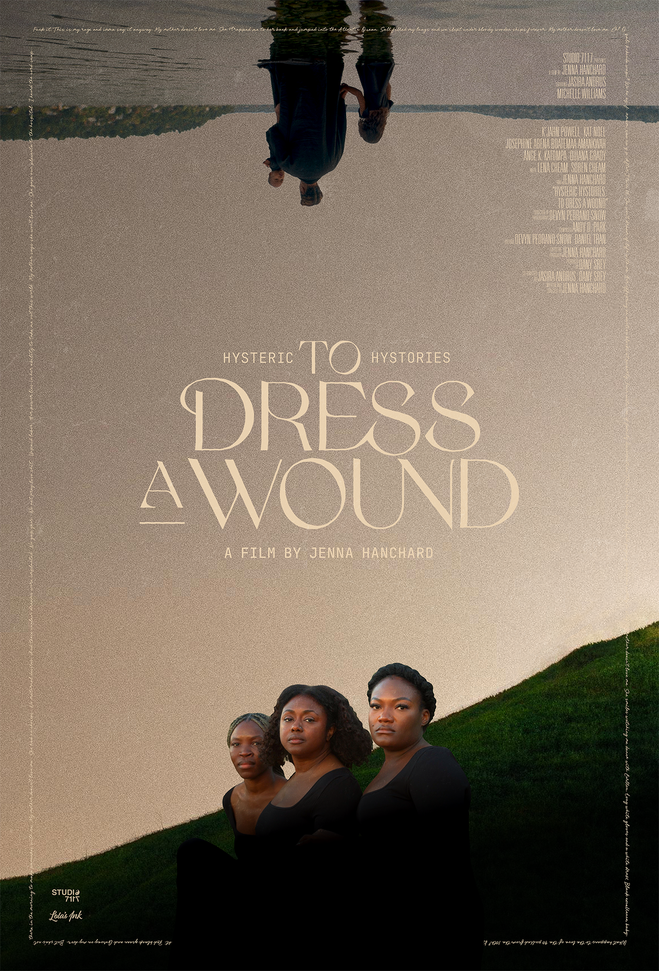
The poster design features imagery from the film and a disorienting mirror composition. At the bottom, the ancestors gaze into the distance and at the top, the mother wades into the water with her children, sea becoming sky.
Encasing everything is a lyrical border — the words of the poem that thread through the film.
Opening credits
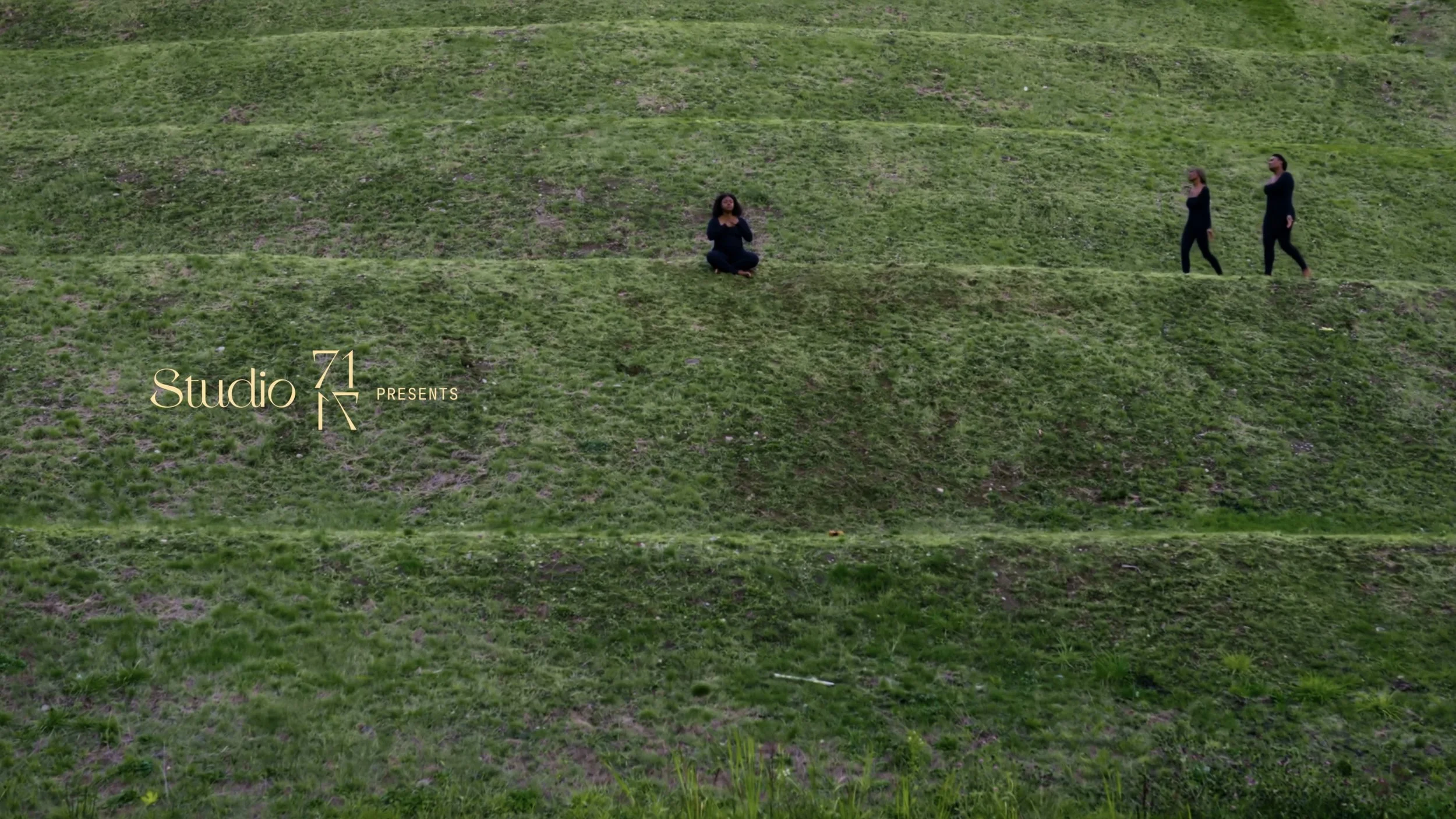
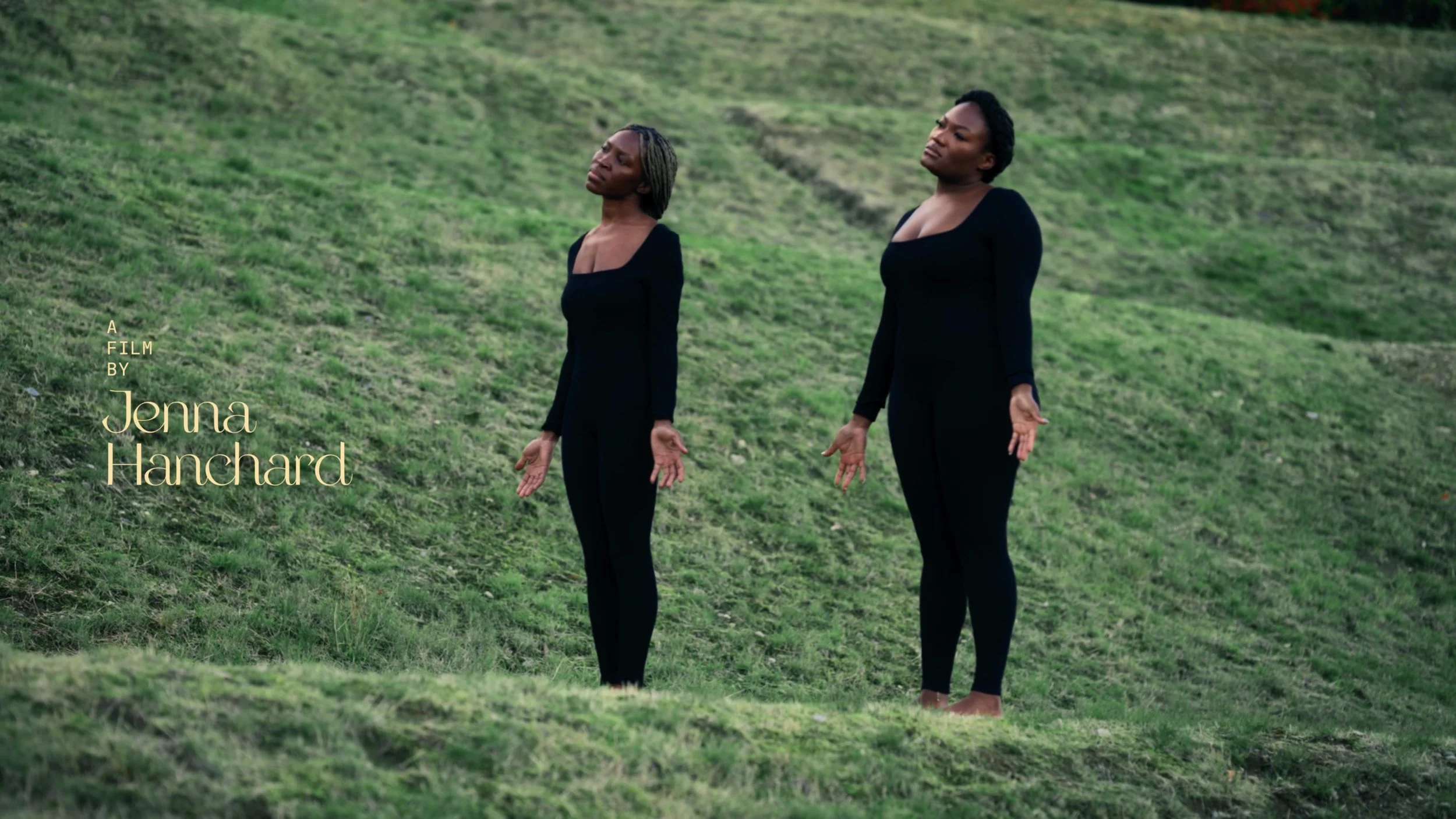
Lyrics text
The film features dialogue in languages including Akuapem Twi, Lingala, and Kréyol, which we wanted to visually articulate on screen.
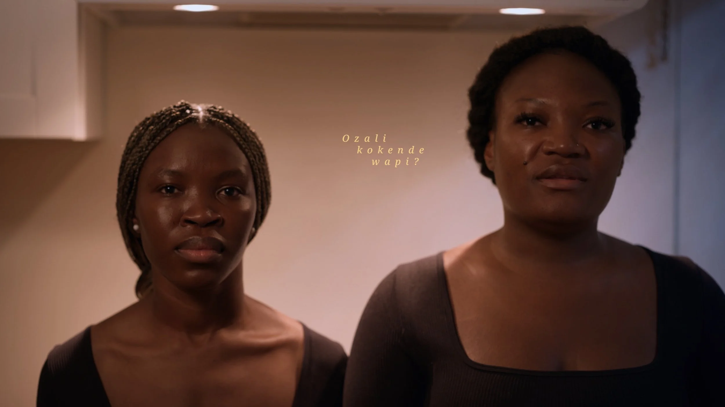
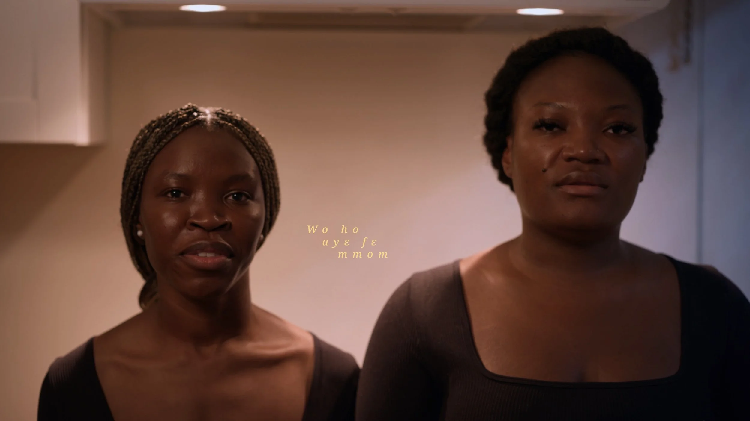
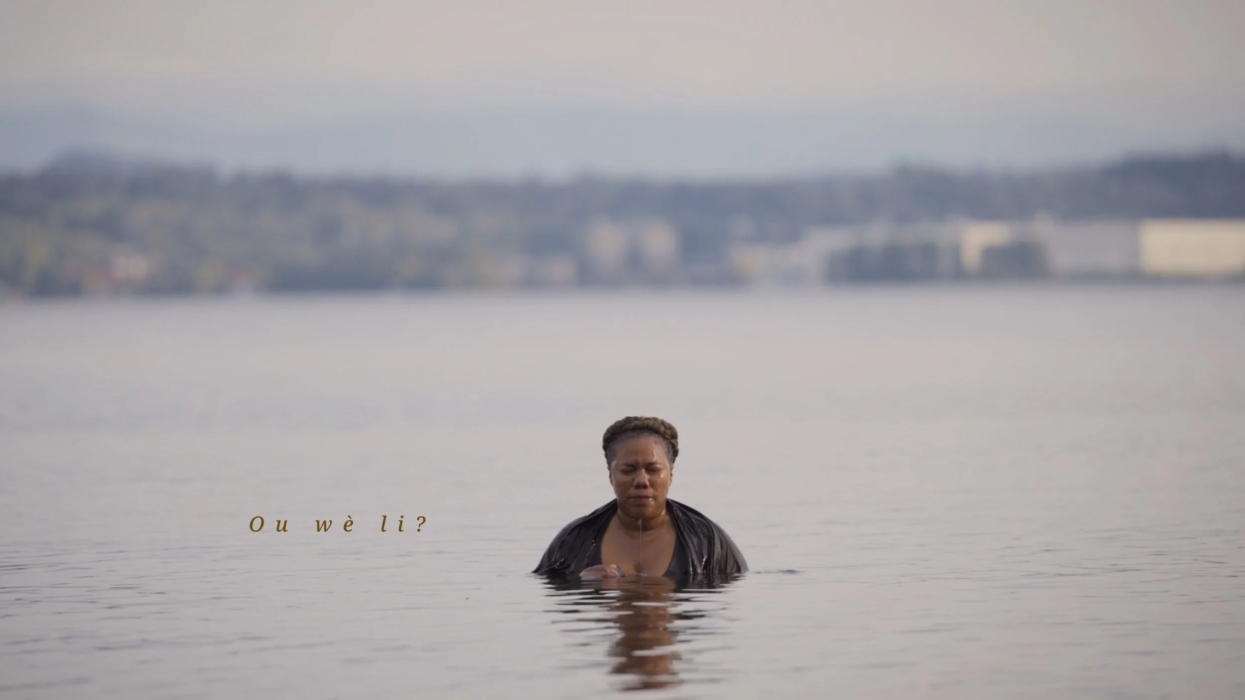
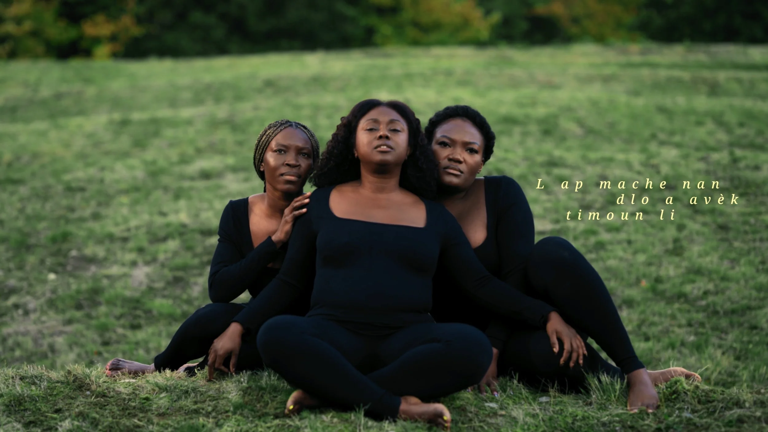
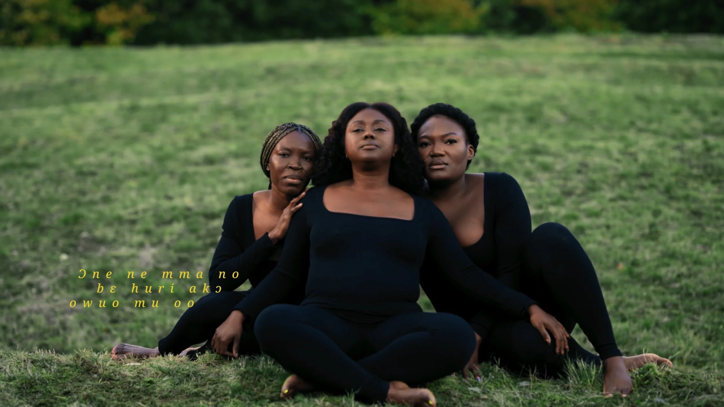
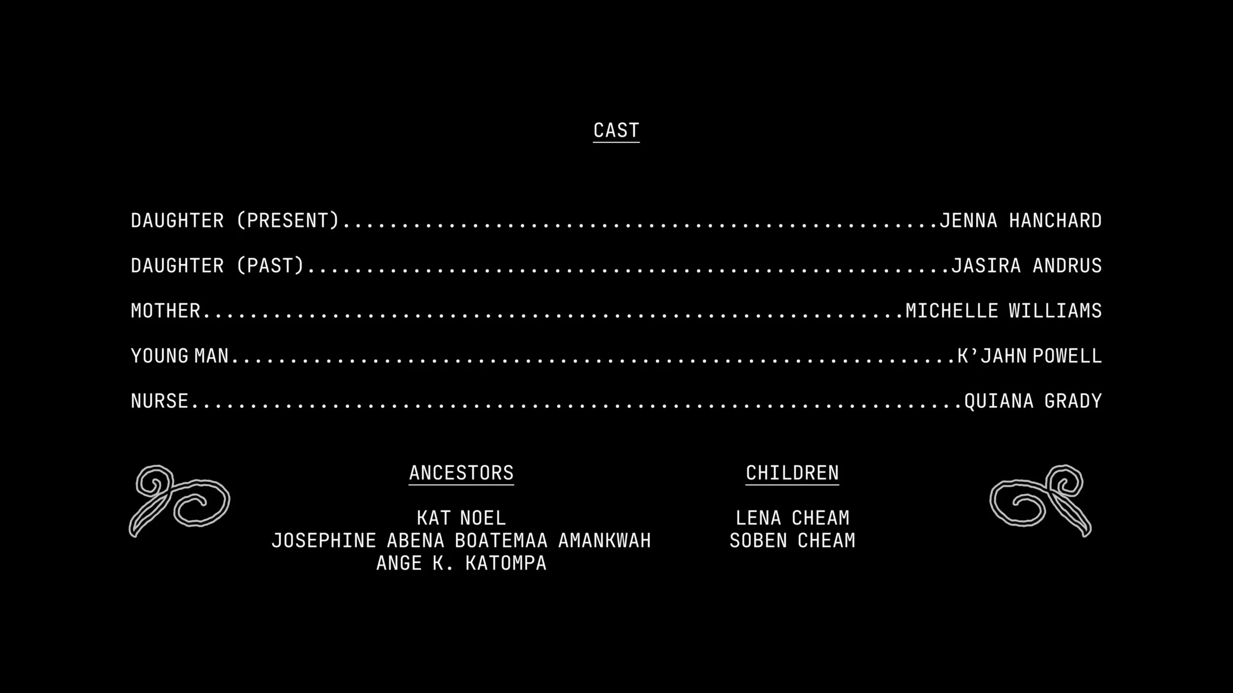
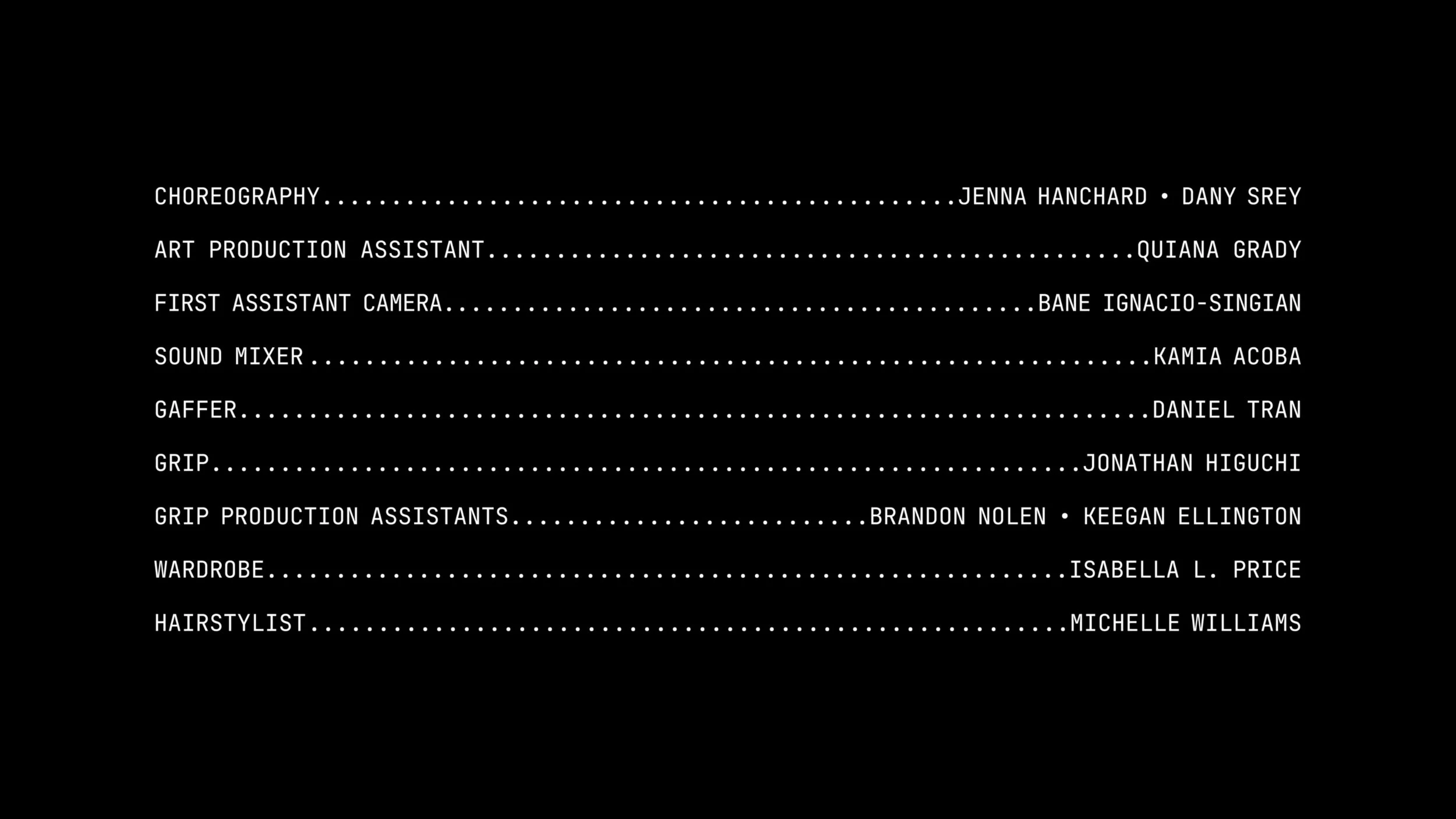
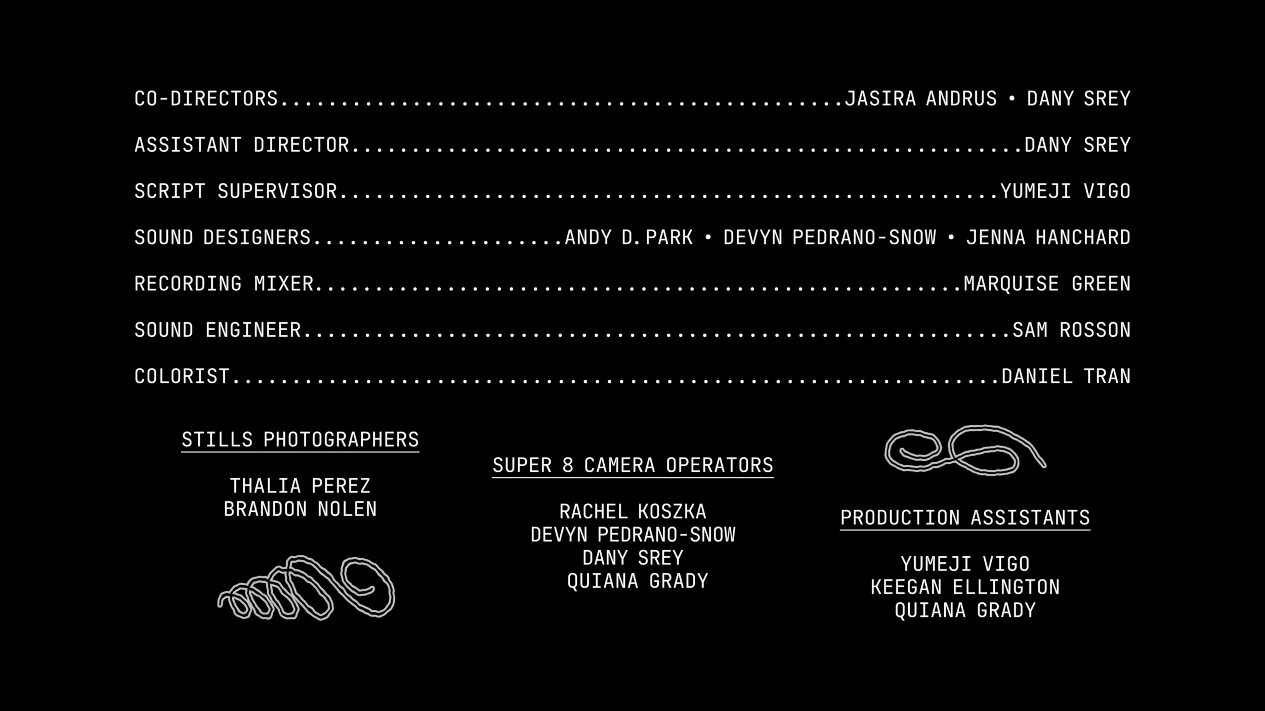
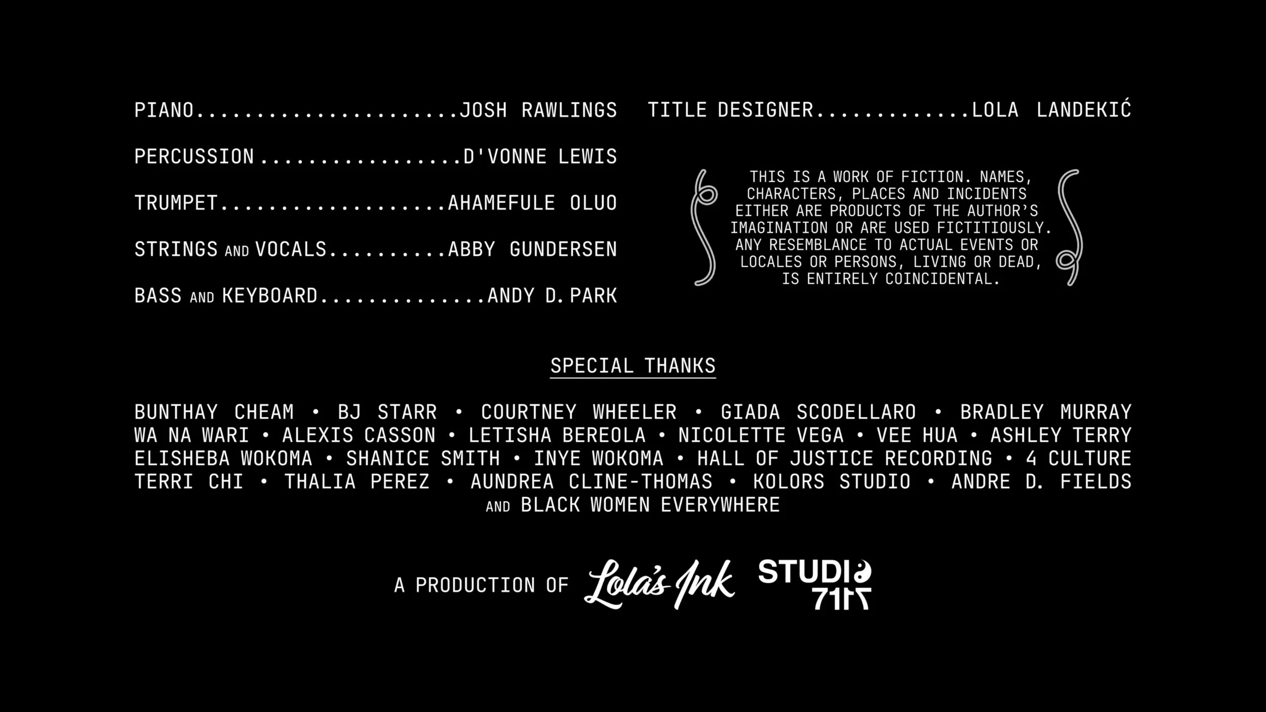
End cards
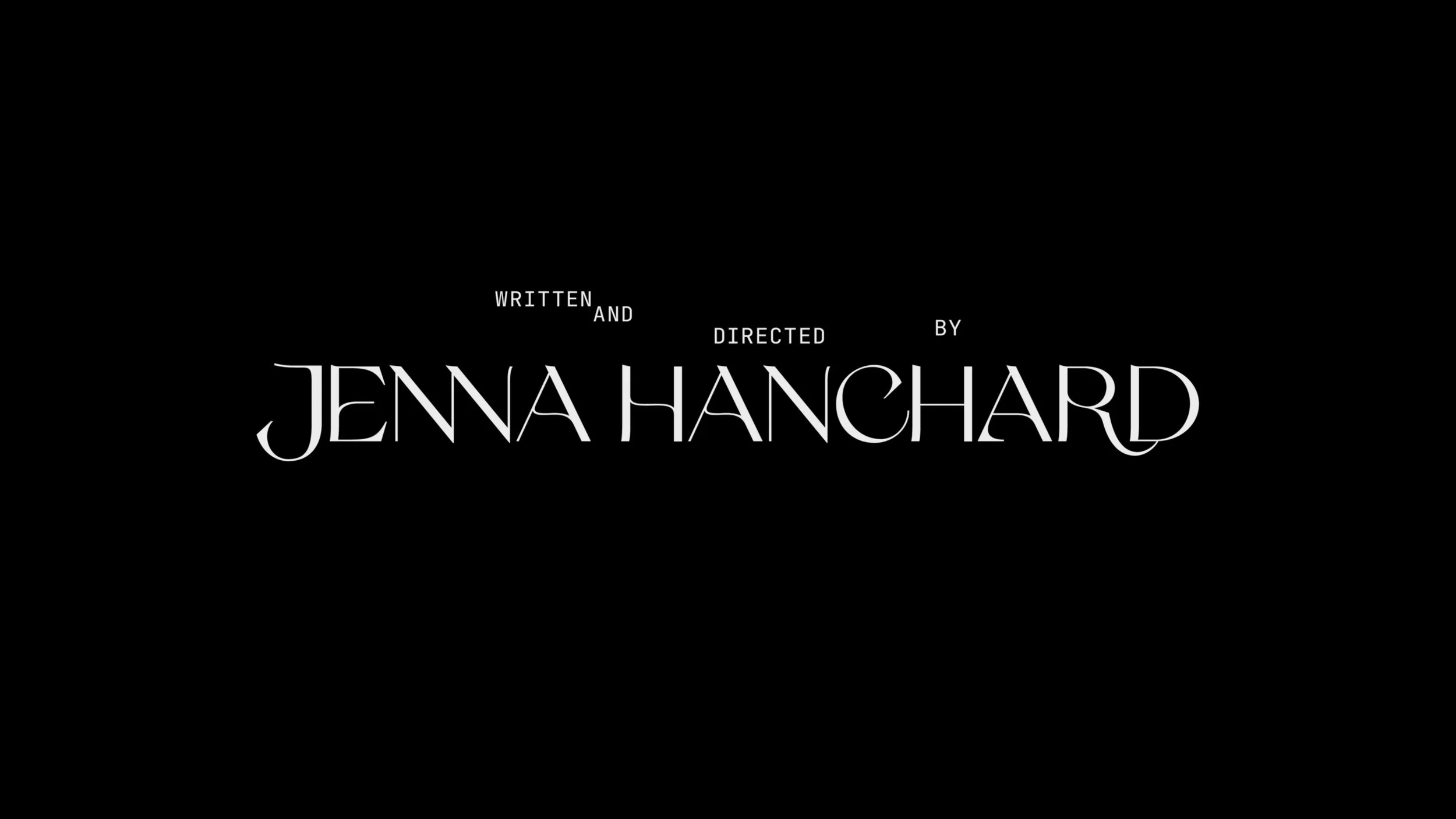
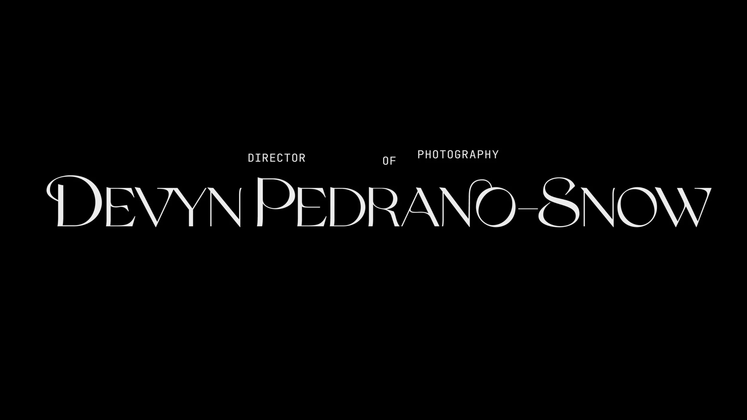
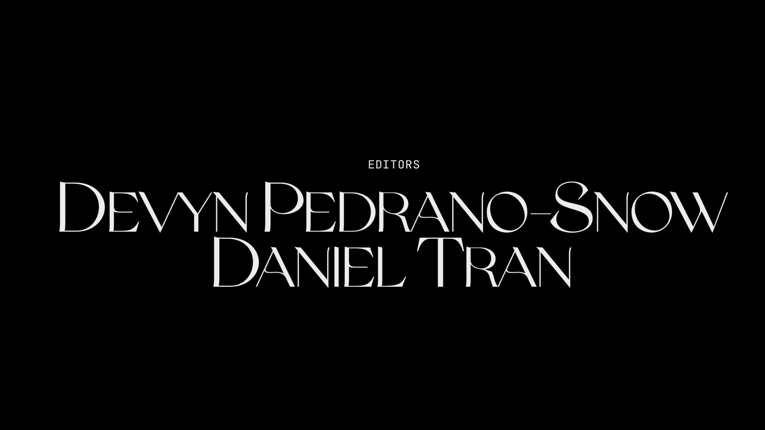
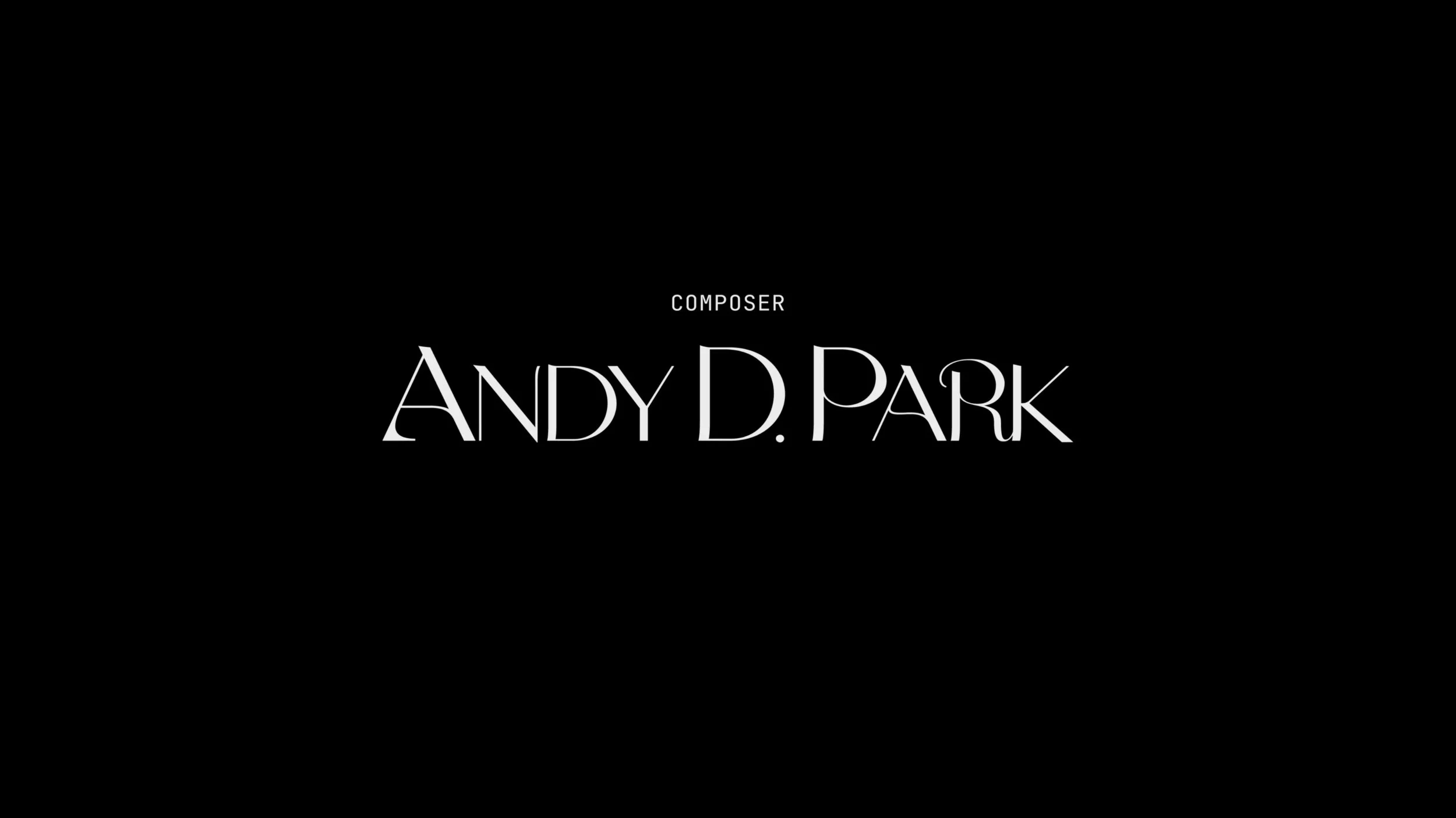
For the end cards, we went with classic white on black, the ligatures from the Korhogo typeface endowing the text compositions with flair and elegance. For the Cast card and on, I added flourishes that echo the unstable strokes of the title wordmark to lend balance and help tie everything together.